Solar Power Plants - Long Term Capacity Factor Trends
How are solar power plants doing? They have grown to be significant contributors to the US electric grid with ratepayer savings and environmental benefits. As the rapid changes in solar technology and the size of projects has leveled off, the long term performance can be more accurately evaluated.
Performance can be evaluated using a standard utility industry metric, capacity factor, the ratio of the electricity produced in a year to the maximum the power plant could have produced if it ran at full output every day.
In October 2025 LBL published their latest update of the following chart:
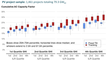
The chart shows predictable trends: solar plants in sunnier places (higher GHI) produce more, plants with panels that follow the sun produce more (tracking), and more DC panel capacity relative to the AC export capacity (Inverter Loading Ratio, ILR) improves production but non-linearly.
LBL opted to use “cumulative” values, i.e. each plant is averaged over its lifetime. More so than other types of power plants, the solar power plant output declines with age, partly due to panel degradation but also due to more frequent equipment down time. Annual decline rates do not seem particularly high (~1-2%), but the effect over the 30 year design life is significant. Cumulative capacity factor, like in the LBL graph, does not provide insight into the degradation rate.
Using EIA data, I duplicated LBL’s cumulative capacity factor chart as a data verification step, then switched the calculation from cumulative capacity factor to average annual capacity factor decline rate over each plant’s operating life. The following chart shows the results:
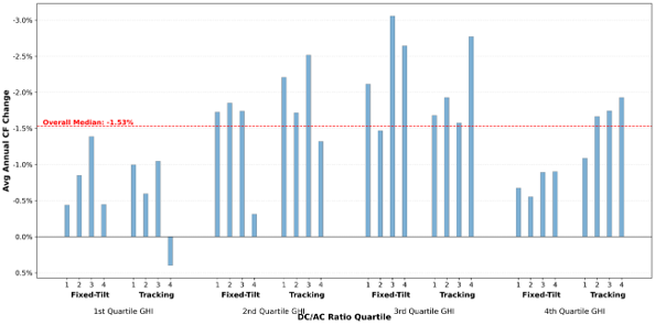
This chart has surprising and non-surprising elements, and some things are muddled. The overall median fleet degradation rate of -1.5% is higher than rule-of-thumb type assumptions, but consistent with other LBL reports, so probably only surprising to some. Sunlight and high temperatures accelerate panel degradation, so it makes sense the degradation generally increases as you move to the right. Tracking plants have more moving parts, so it is logical they will have higher degradation from equipment failures. More DC capacity relative to AC capacity should mitigate some of the degradation which appears in most of the groups but not all.
But, the data is not consistent. The 1st-3rd GHI quartiles look reasonable, but why is the 4th so much lower? Or, the 1st and 4th look reasonable, but why are 2nd and 3rd so much higher? The likely explanation is a third factor, in addition to panel degradation and equipment downtime, is causing the inconsistent results: curtailment of the plant’s output due to grid constraints. Curtailment will be the subject of a separate write up.
Some projects start out with overly optimistic assumptions on key parameters such as sunniness, shading, panel cleanliness, wire losses, etc. Any excess optimism in these assumptions is usually rectified in the first year of operation. This over optimism has been well covered elsewhere, and this analysis avoids those issues since it is comparing year over year operations.
Putting curtailment aside, examining solar power plant performance from the perspective of annual capacity factor degradation provides more insights about future operations, and it can provide a better basis for design decisions as new plants are built. Operators and developers can compare proposed new plants to peer plants setting reasonable performance targets. A clear understanding of the degradation rates of existing plants may temper the relentless pressure on capital cost reductions and the resulting impact on the quality of the plants. Considering capacity factor degradation rate also enables policy makers and regulators to make fleet wide projections more accurately.
